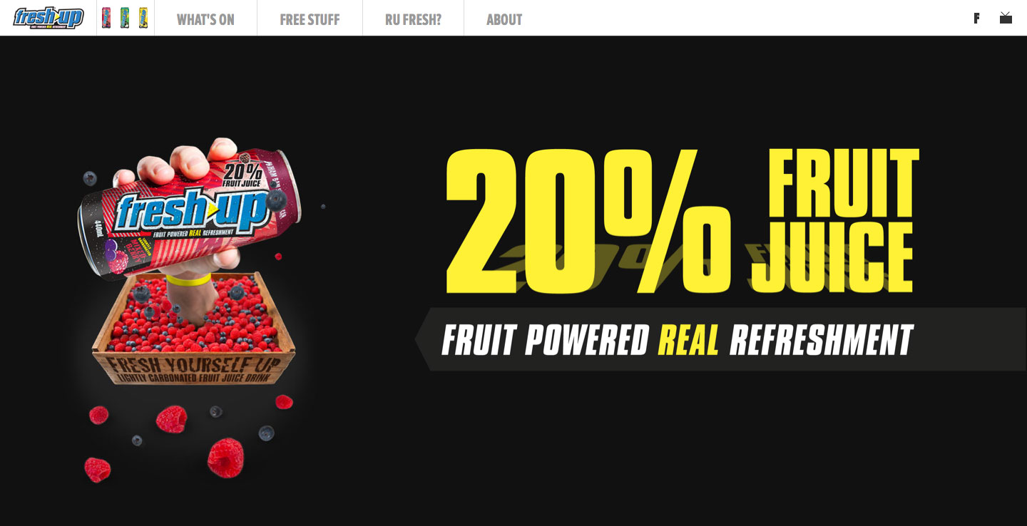
Fresh Up is one of New Zealand’s top-selling fruit juice brands. With a recent Australian roll out, we were involved with the design and development of a custom build website.
Our digital team designed and created brand new key art for the Australian campaign which was used for all point of sale and in the new TVC.
In conjunction with our events team, who were managing a Queensland promotion to find a new local king of comedy, we were tasked with bringing a digital platform to life that would serve as a destination for new hopeful talent and that heavily was sponsored by this brand.
We used a single page, smooth scroll approach to house the majority of content here, bringing in interactive elements throughout. One of these elements was a parallax effect used on the main hero image, moving the pieces of fruit according on the users mouse position.

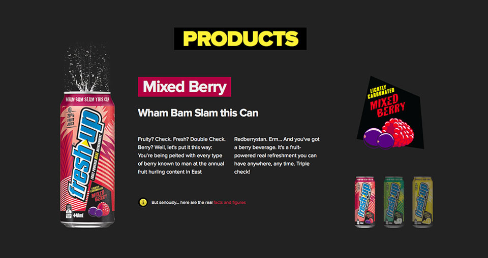
PRODUCTS
We used a responsive sliding carousel to showcase the Fresh Up range, allowing users to find out the facts and figures on each product.


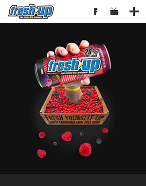
RESPONSIVE
We adopted a mobile-first approach, allowing users to access content on the go and on a range of devices.

Related topics: