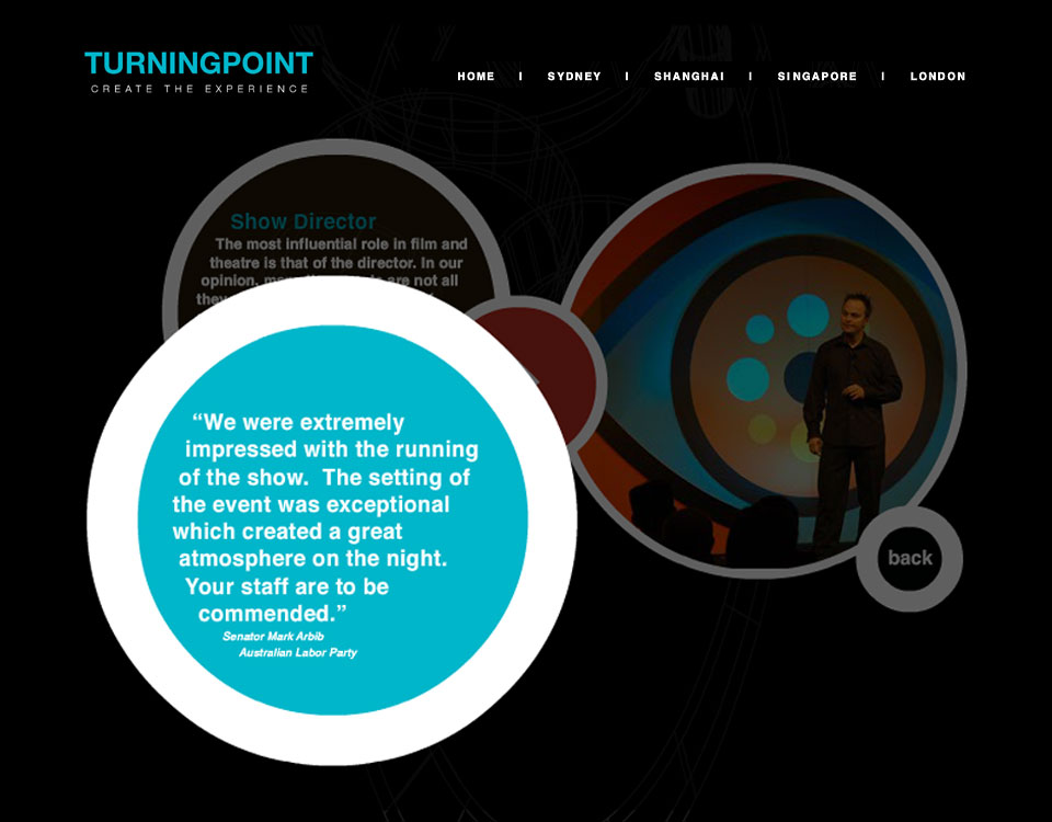
This client came to us with a specific request to use Flash for their website.
BRIEF
- To build a new website.
- Create an experience that makes the viewer want to call.
- To create interest and show this is a creative company.
After discussing the brief Turning Point Solutions, and understanding that they were looking for a one-off showpiece, we decided to get to work.
Offering a site that is dynamic and provide an easy navigation was key to what we wanted to achieve. Not breaking the back button was one of several things we didn’t want to do. Users expect this to work for them. The rest of the navigation was designed around the logo look and feel, keeping the creative circular throughout.

We had a ball designing this site and ensuring we were creating a user friendly experience that still worked inside the client’s brief.
Related Topics: